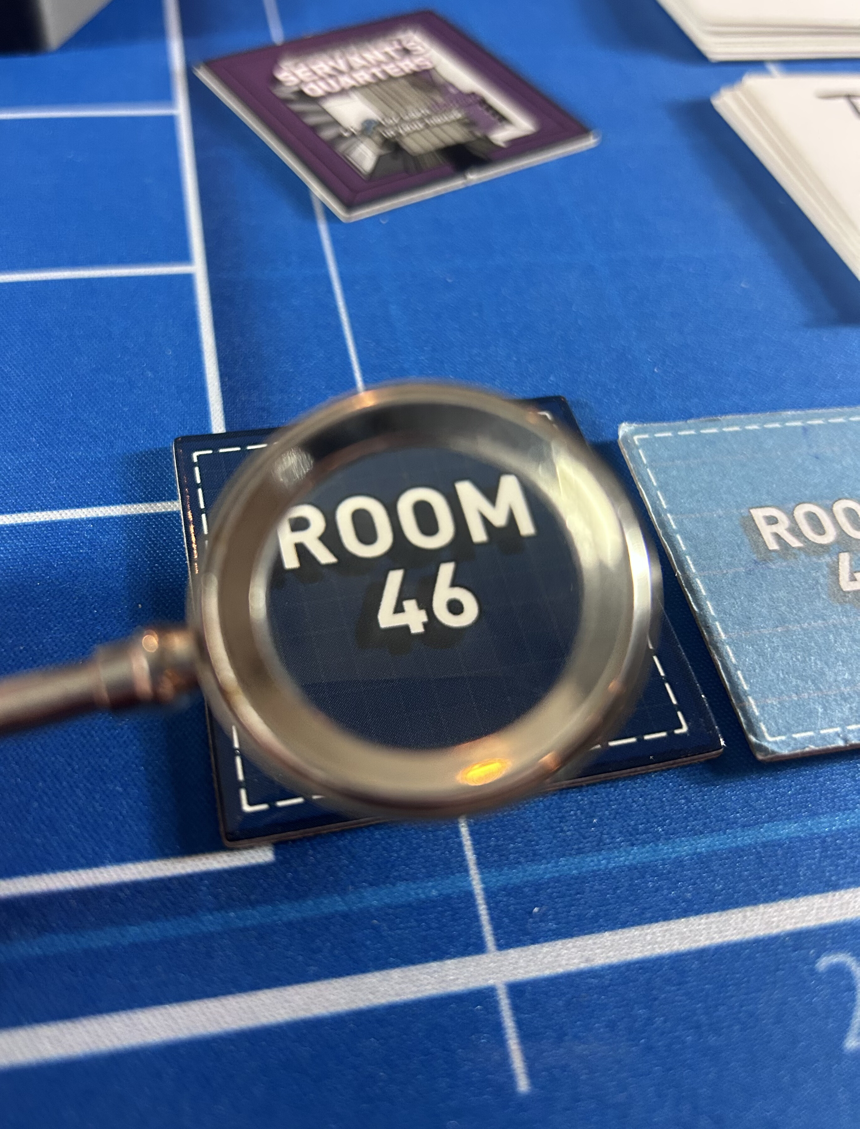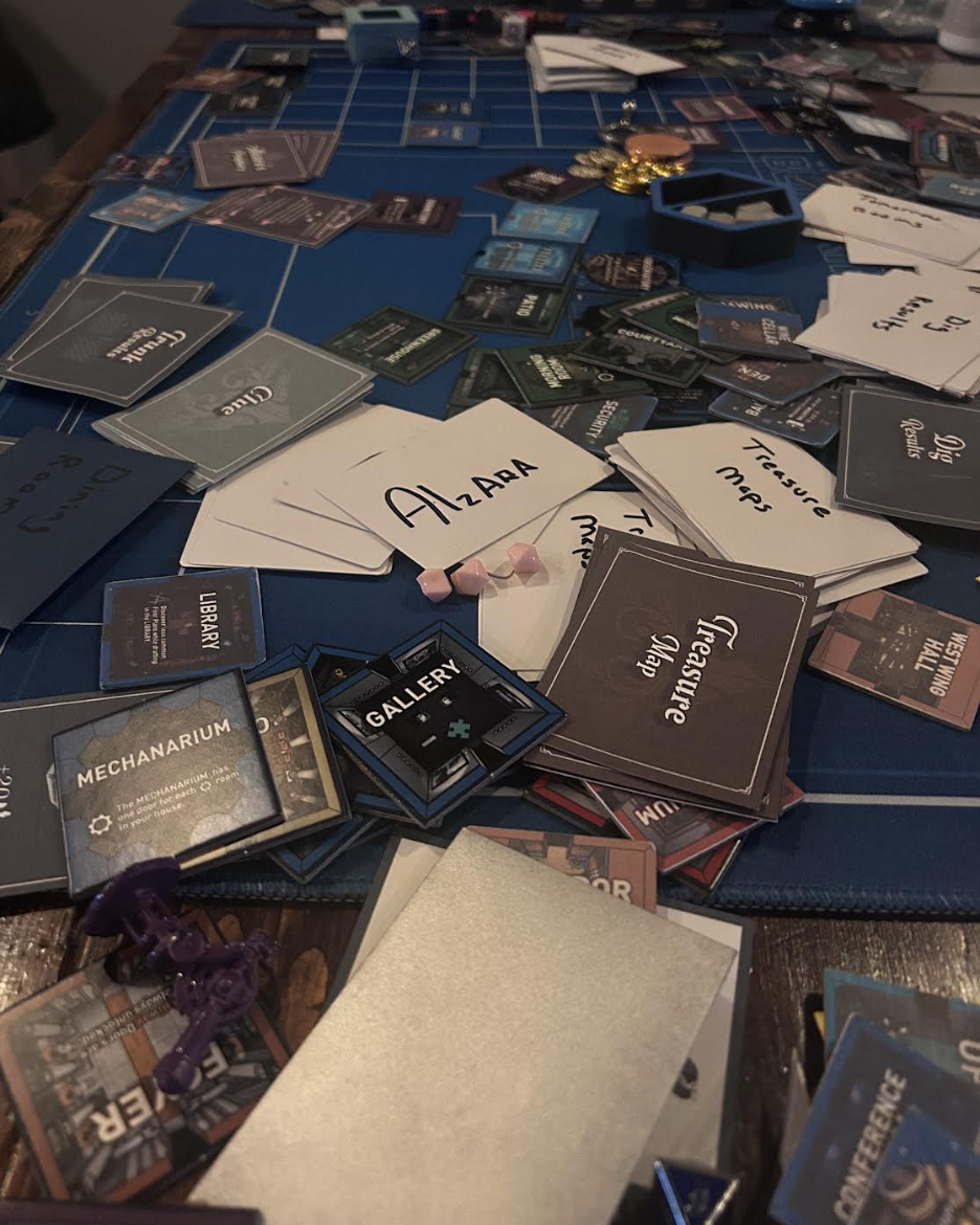
The dev log went quiet this summer because the work did not. Since June almost nothing here has been HTML; it's been paint, cardstock, print orders, and a table that never got cleared. Post 30 covered the cards. This one is everything else, and it leaves the project somewhere I don't have a tidier way to describe than this: an awkward teen phase. Past paper prototype. Not yet a cohesive, finished thing. The cards have real art now, printed on stock too flimsy to feel like it belongs next to that art. The tiles are genuinely beautiful and the border color clashes with some of the rooms it's supposed to frame. The props are pulled from wherever a piece could be sourced — a real keyring, a resin flower, a 3D-printed telescope — and you can tell, because none of them agree with each other yet.
None of that is a complaint. It's just what this stage looks like. The rest of this post is the evidence, room by room. (One thing from this stretch got big enough to need its own post; that's next.)
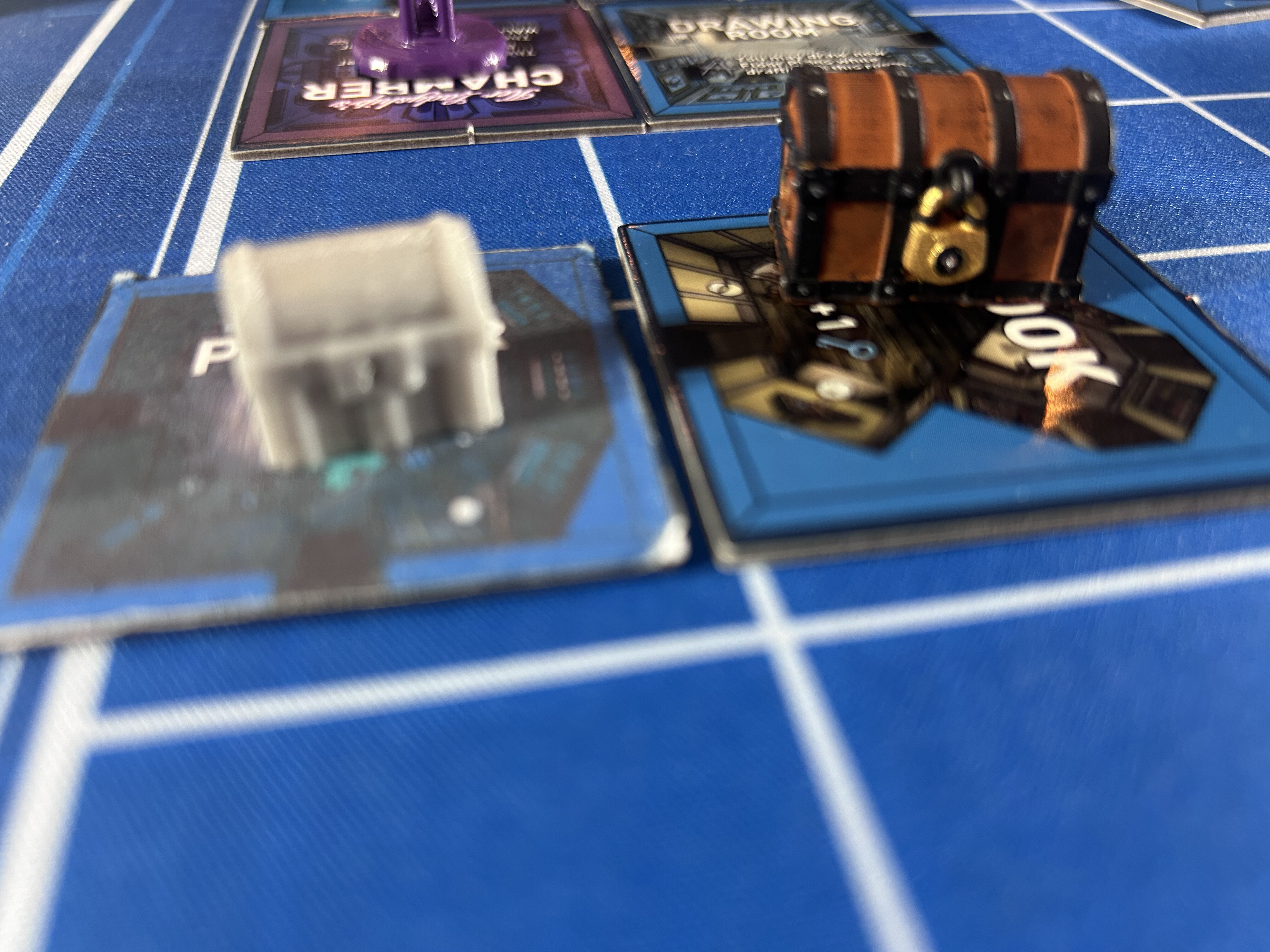
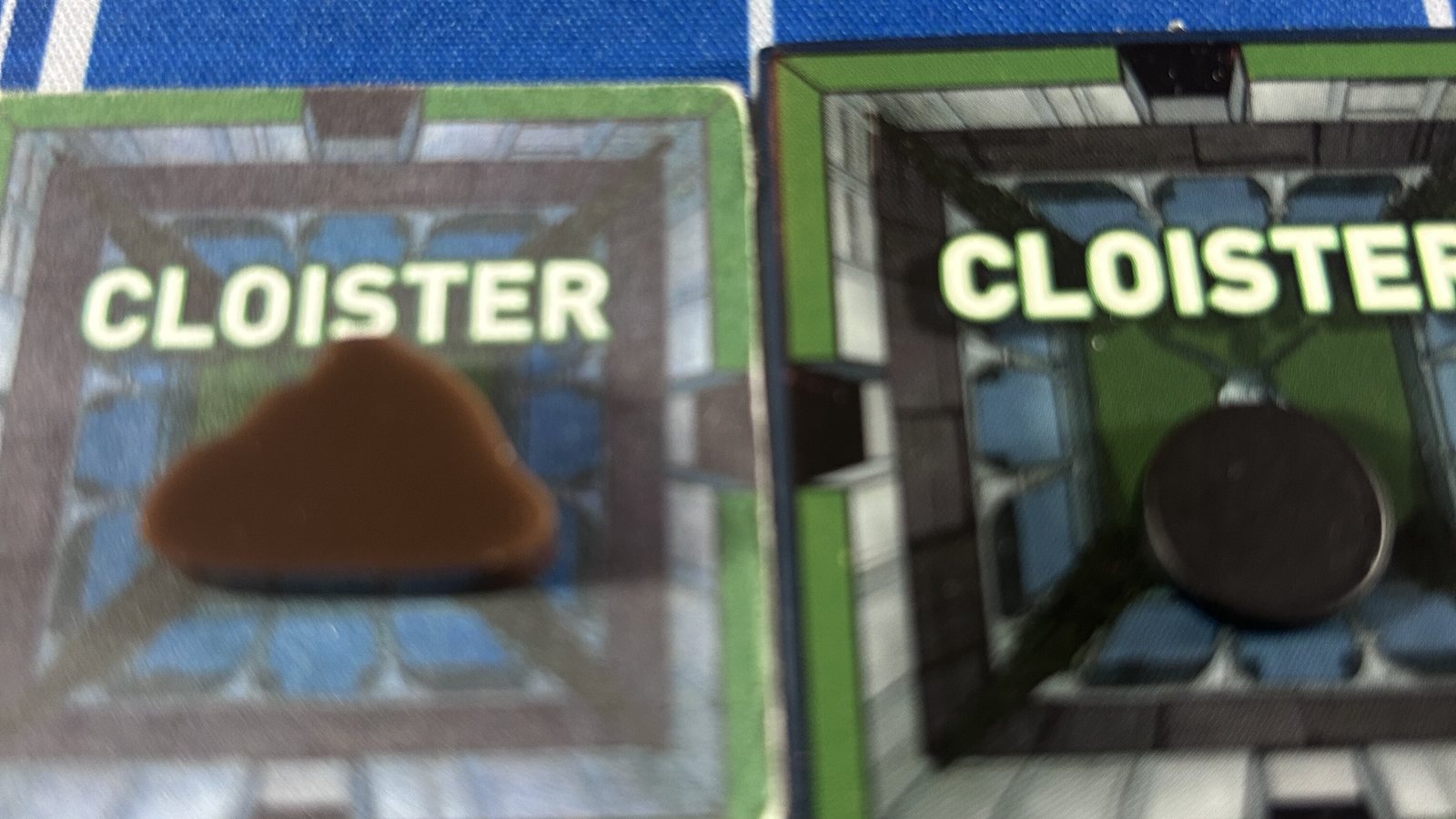
The chest photo isn't the before-and-after it looks like. Those are two different miniatures, both found online, three inches apart on the same tile. The painted one is the larger, higher-detail casting, and in walnut brown with black iron bands and a gold padlock it lands very close to the trunks in the video game. It's also huge. On a 40mm tile it stops being a marker and starts competing with the room it's sitting in. The small gray one has less detail, which is the point: it could be painted however I want, and it fits. I'm showing them off because they're flashy and I like them. I'm not using either.
An honest aside, because the chest photo argues for something I decided against somewhere in the month it took to write this. The original intent for trunks and dig spots was abstraction: a solid gold cube stands for a trunk, a dark disc stands for a hole, the same visual language a die already speaks. A painted miniature is a different proposition. It photographs beautifully, and it takes up a third of a 40mm tile, next to a padlock, next to dirt piles, next to a player marker. "Looks good on the table" and "plays well on the tile" are two different tests, and Session 3 already told me tiles get crowded. So the cube won. The most abstract option, the least photogenic, and the one that leaves room for the game. The chests go in the drawer with the lottery spinner: things I built to find out I didn't need them.
Small Objects
The upgrades you feel before you notice
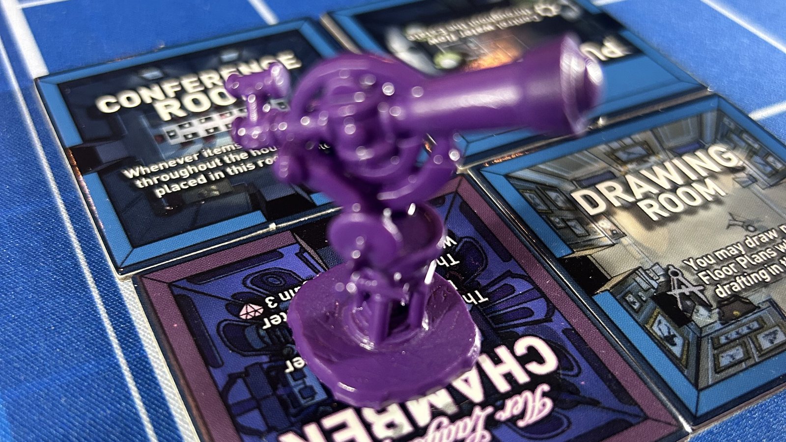
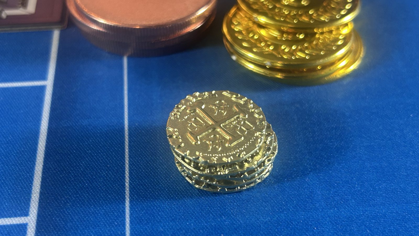
Some of this month's work is easy to miss in a photo and impossible to miss at the table. The coins went from oversized plastic placeholders to embossed metal doubloons with real weight to them. The dirt pile is sculpted now. The dug hole is not, and that's deliberate: it stays a plain metal disc, the same call as the cube. And the Telescope is a painted miniature instead of a card, standing where the game says it's found.
The Decks
Round one
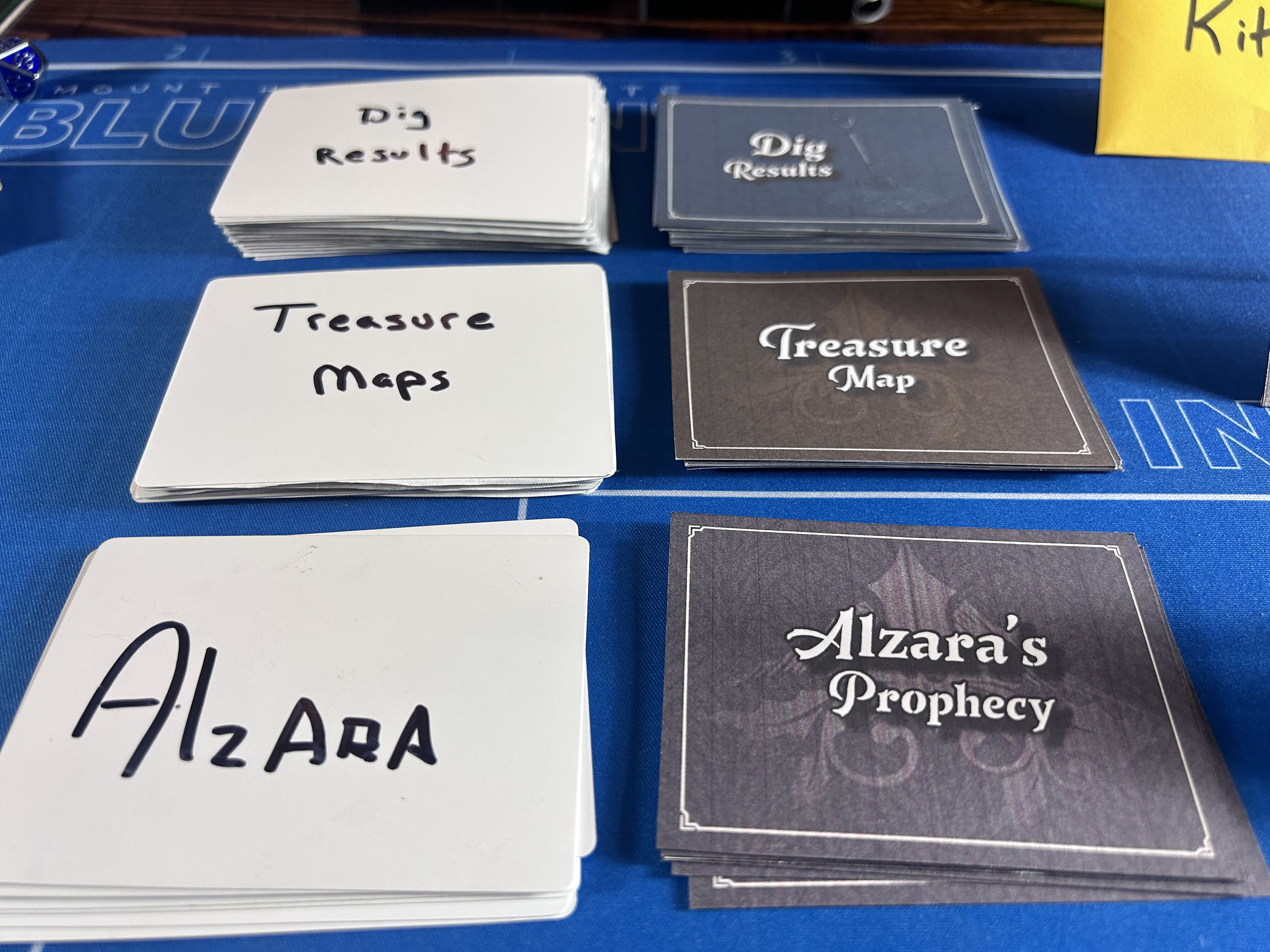
The cards are the biggest gap between how the game looks in a file and how it looks in your hand. Post 30 went through all ten decks as designs. Call that round one. Not a handwritten prototype anymore, but not a finished design either: it's the first version made to be looked at, and looking at it is already producing notes. The most obvious one is that everything prints dark. The navy that reads as depth on a screen swallows the illustrations on paper, and the flat colors show the inkjet in them. Some of that is the home printer and the thin stock. Some of it is the design, and I expect the visual system to change once these have been through a few tables.
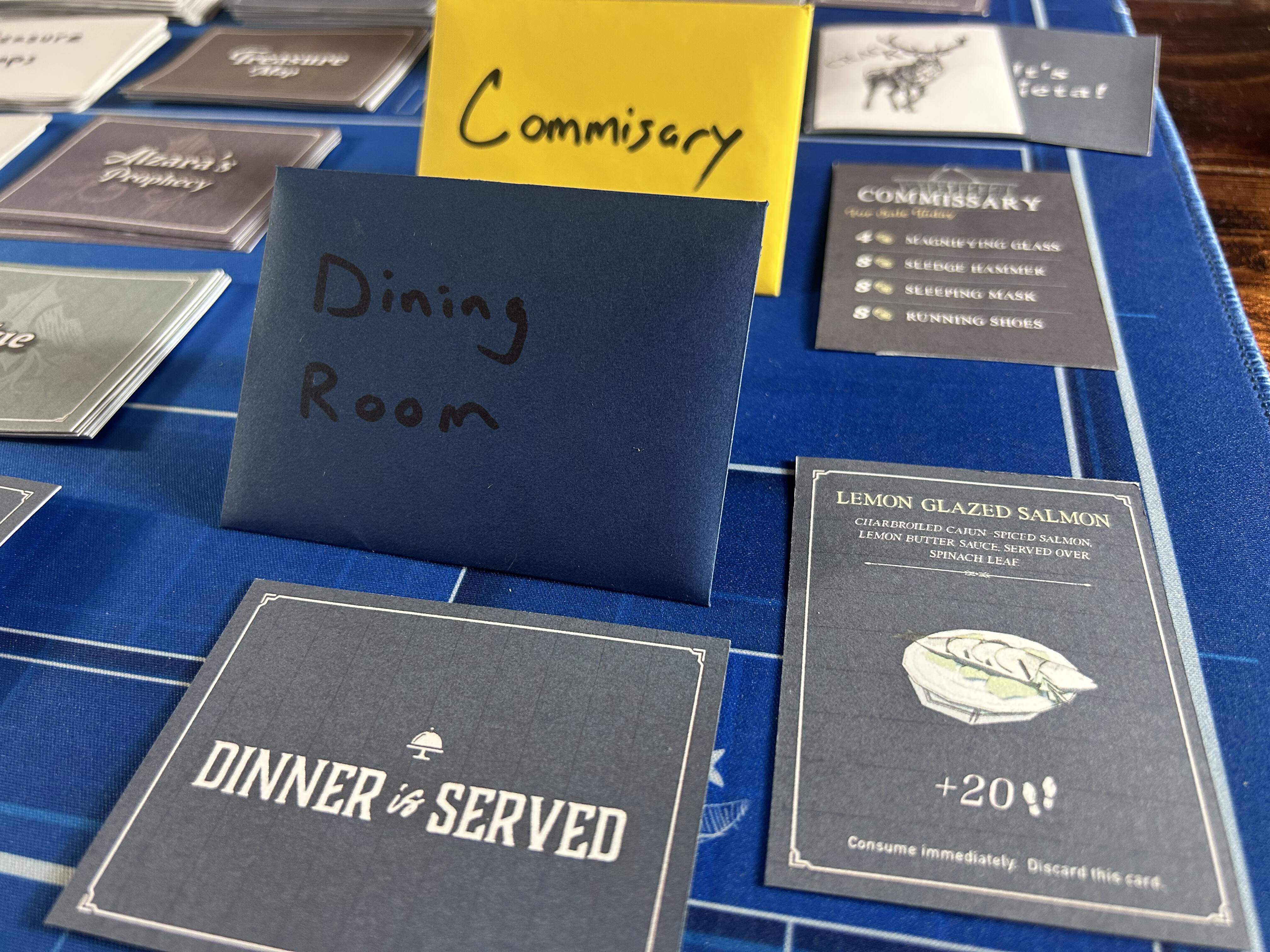
The food and shop cards carry the most art and get read mid-turn, so they're where the notes pile up first. The Lemon Glazed Salmon has an illustration, a description line, a step value, and its discard instruction, and it prints darker than it was drawn. That's the kind of thing you only learn by printing it. The tiles have been through a professional run and a round of fixes; the cards are one round behind.
The Rooms
Three generations, on the table at once
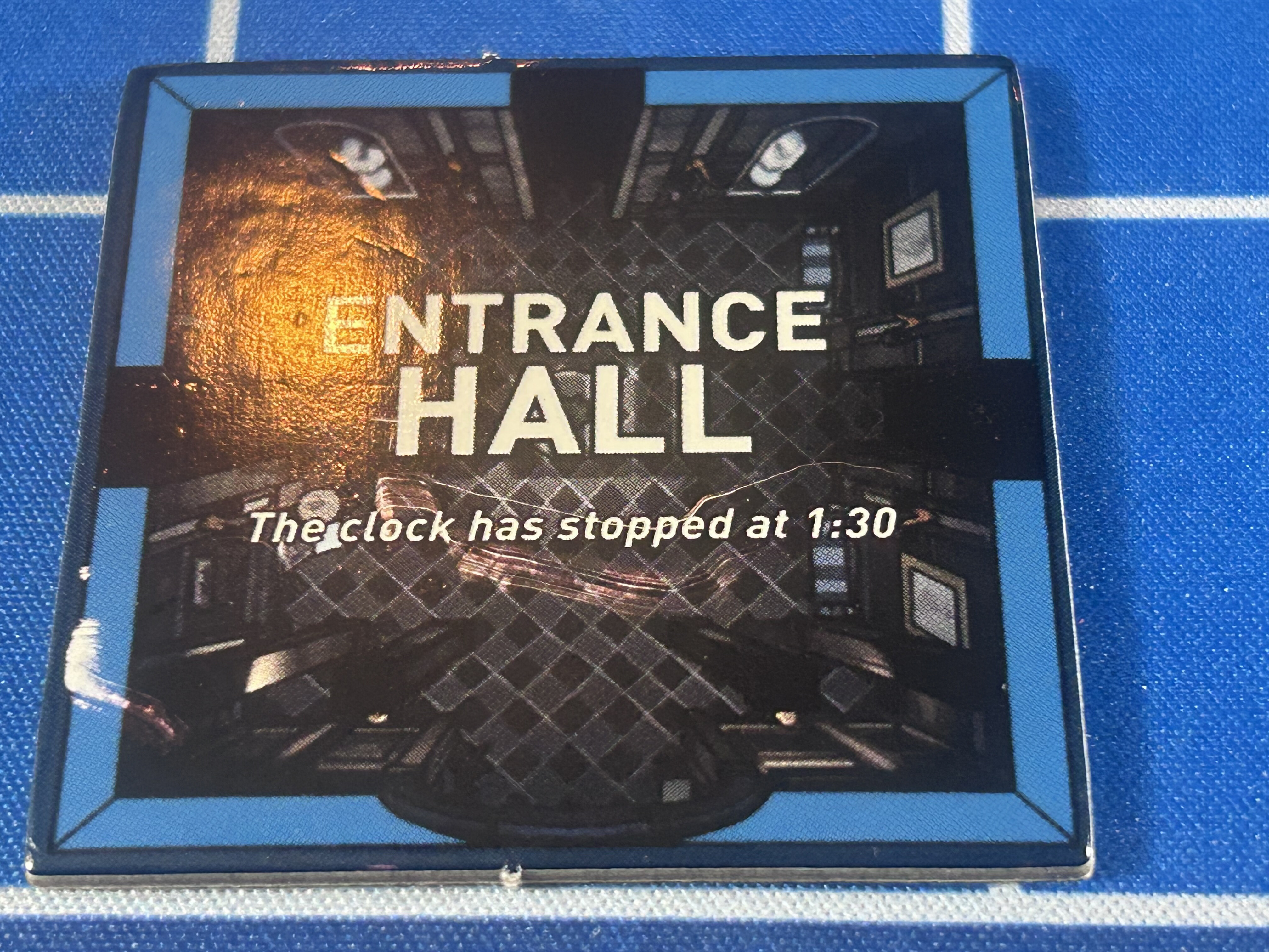
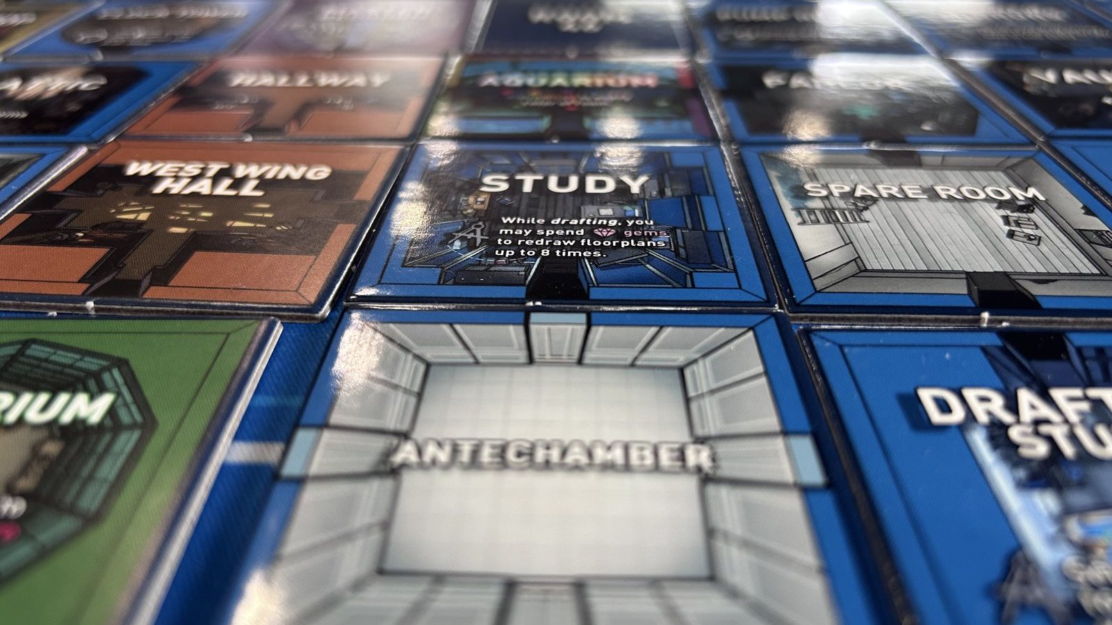
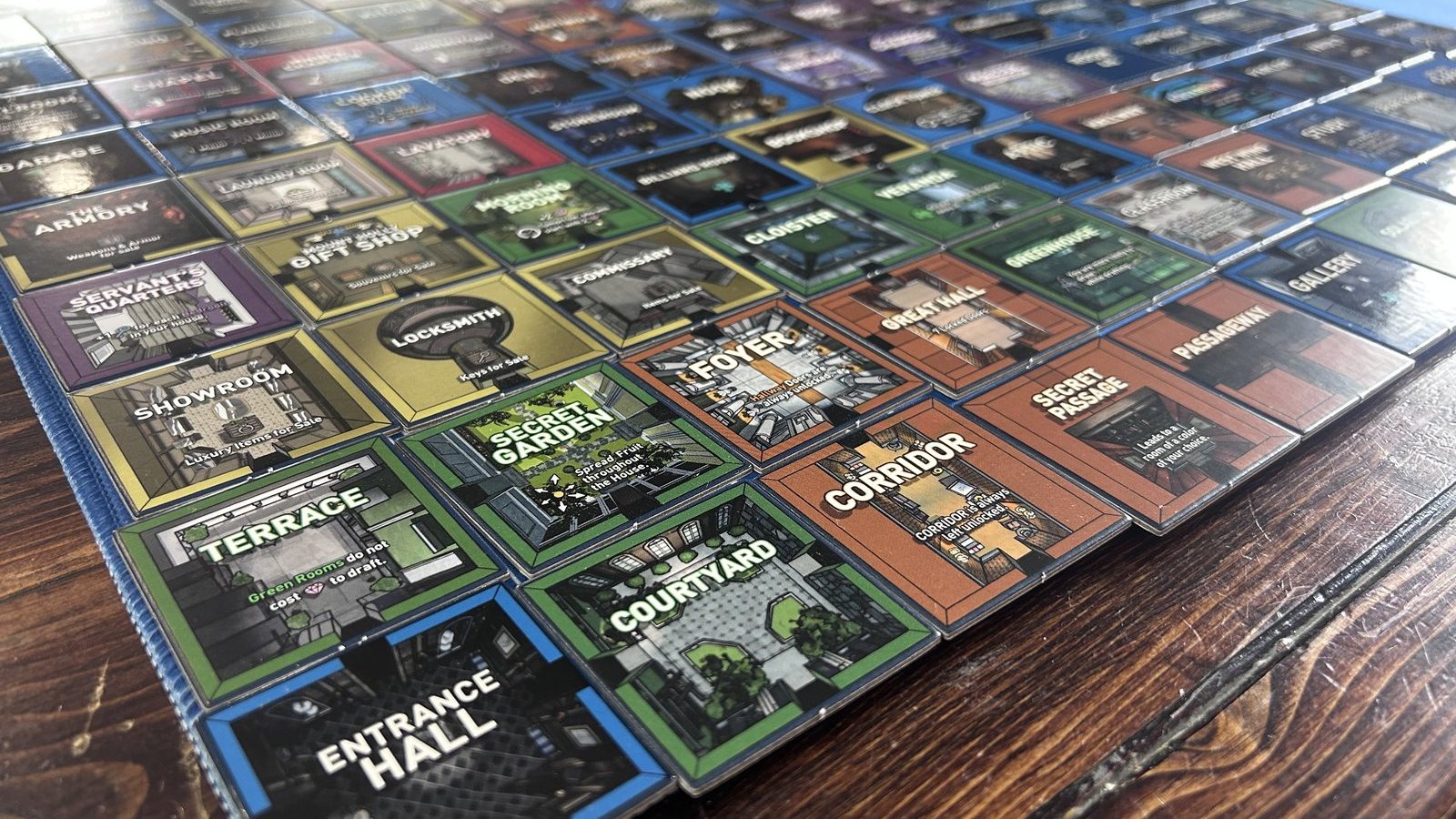
Most tiles are functional — read the name, read the effect, move on. A few are doing more than that now. Entrance Hall is the one I keep coming back to: the golden light down the center of a dark hallway, and a single line of text that isn't a rule at all. That line is mine. Every other word on every other tile comes from the game; this is the only place I've added text of my own, as an experiment in planting a puzzle clue where a player will read it on turn one. It may not survive. It's worth noting while it's there.
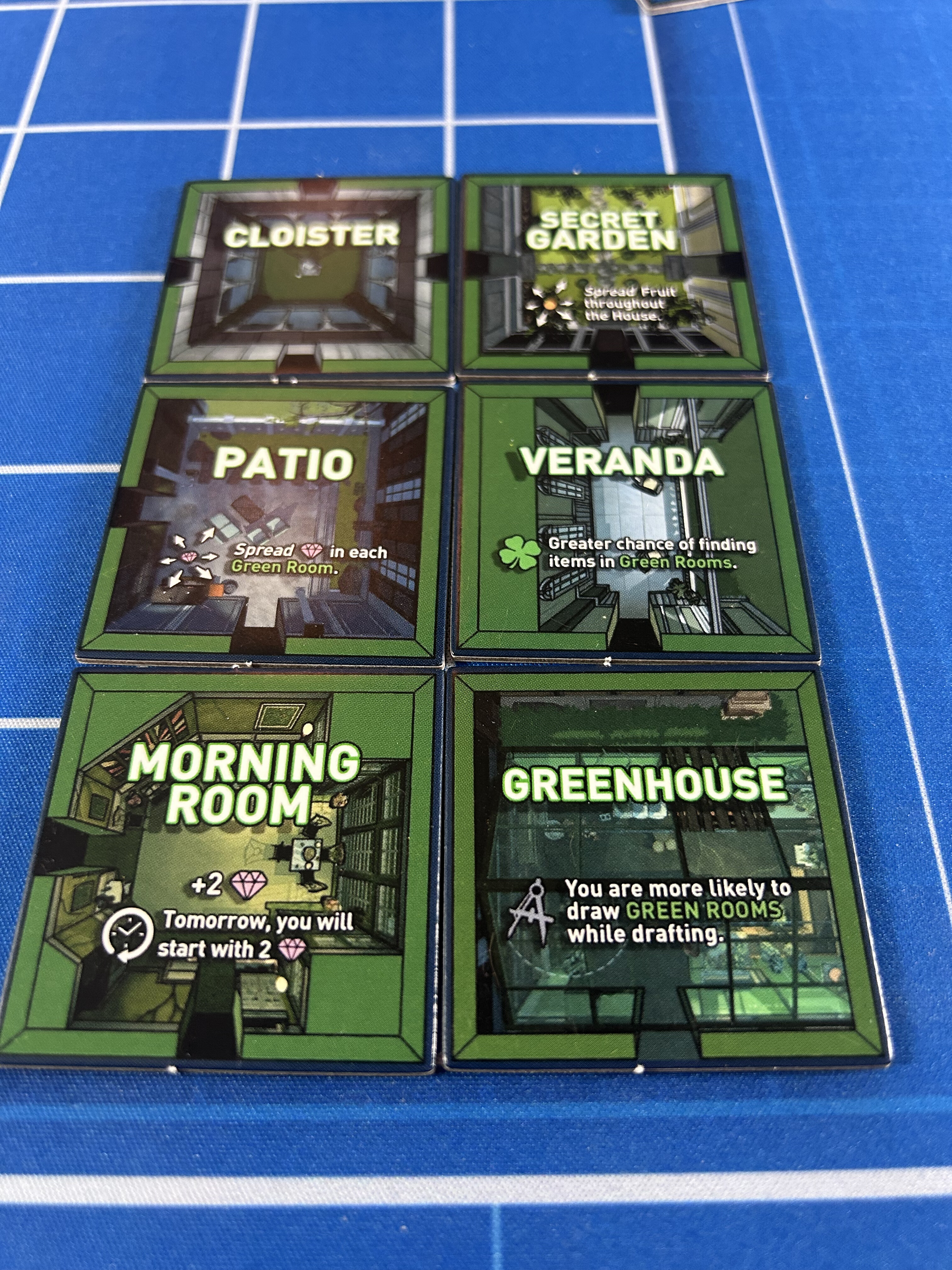
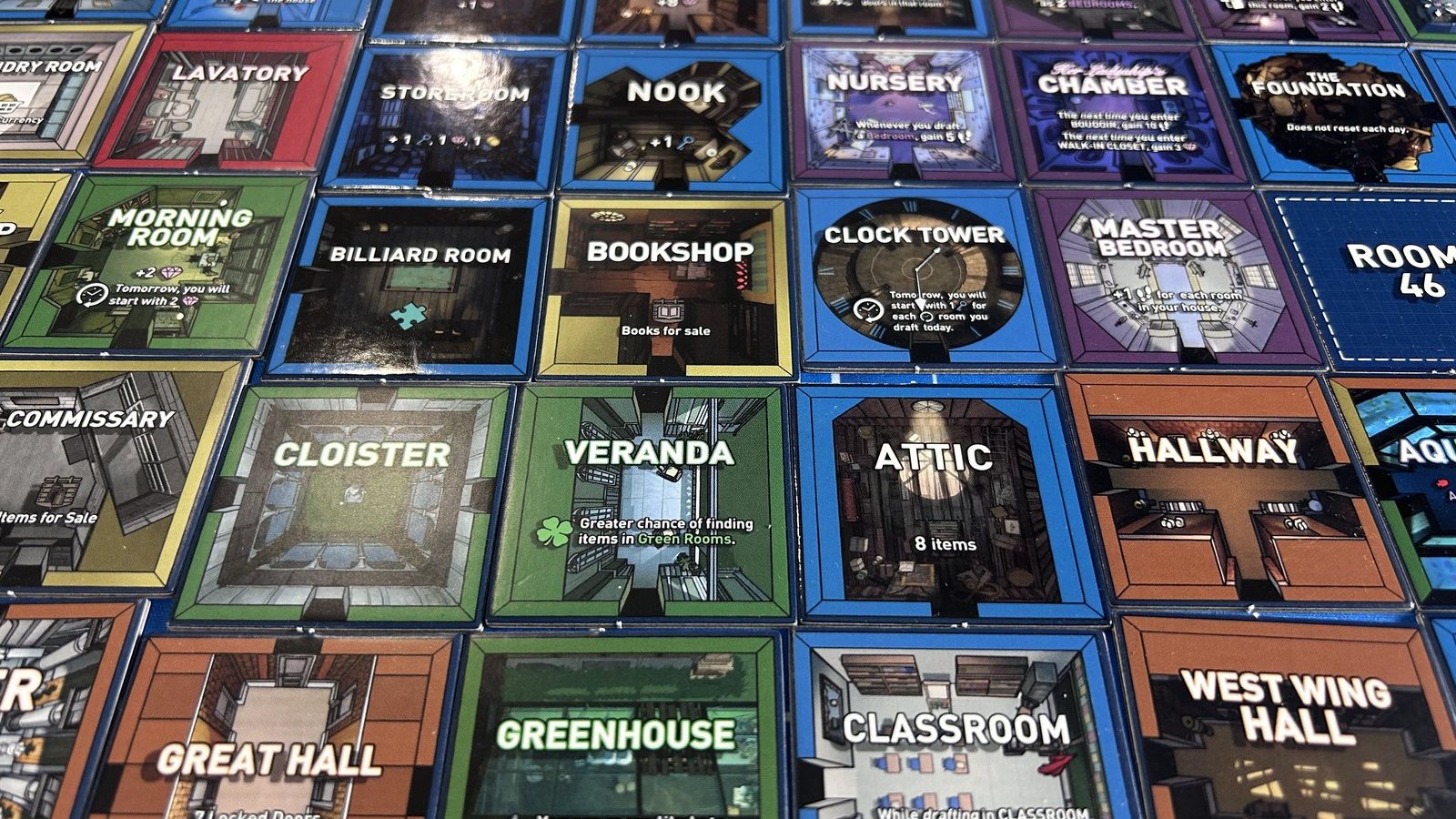
The Green Rooms read as a family now in a way they didn't as separate placeholder icons — same border color, same information layout, six different rooms that are legible as a set from across a table.
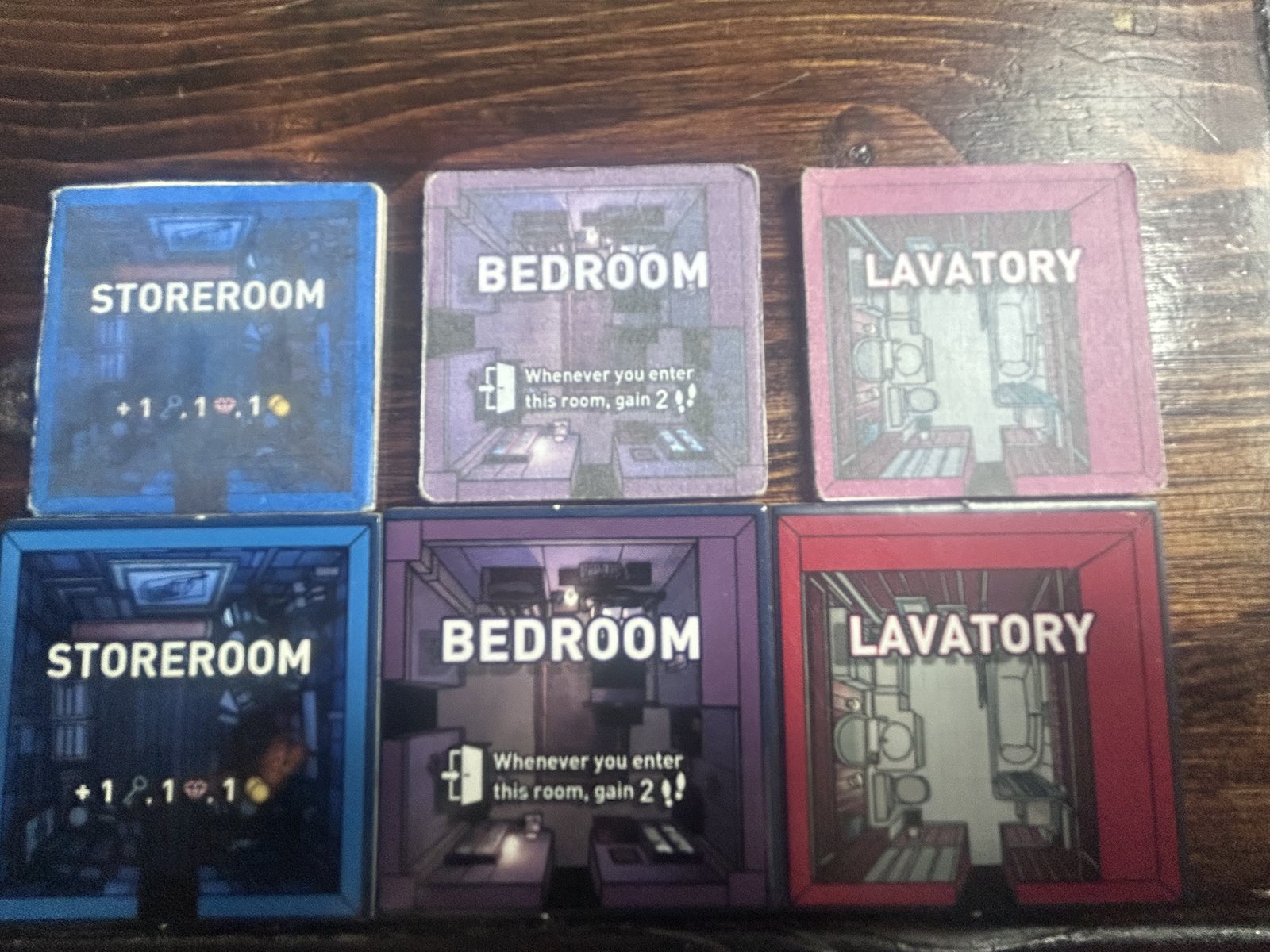
What I didn't expect: there are now three distinct tile generations sitting on the same table, and one of the splits was a surprise. Produced-matte and produced-gloss look like two deliberate finish options, but they weren't — they came from two separate orders I didn't realize used different finishes until they were side by side. A happy accident, since it's an unplanned matte/gloss comparison for free. It would've been a real problem if this had been a real shippable run instead of a prototype pass. Add the original, smaller, beat-up first-prototype tiles still in circulation, and that's three generations of the same room coexisting at once. The matte/gloss split doesn't photograph. The generation gap does.
Up close is where the produced tiles earn it and where the one real flaw lives. The die-cut edge is clean, the registration holds, the door notch is exactly where the file put it. And every tile carries a thin blue rim at the very edge, outside the room's own frame. The bleed was set in one color for the whole run, and that color is blue. On a blue room it disappears. On a purple bedroom, a red room, a green room, it's a hairline of the wrong color around the outside, and once you've seen it you can't stop seeing it. It's the first fix on the list for the next print: bleed in each room's frame color, not the house color.
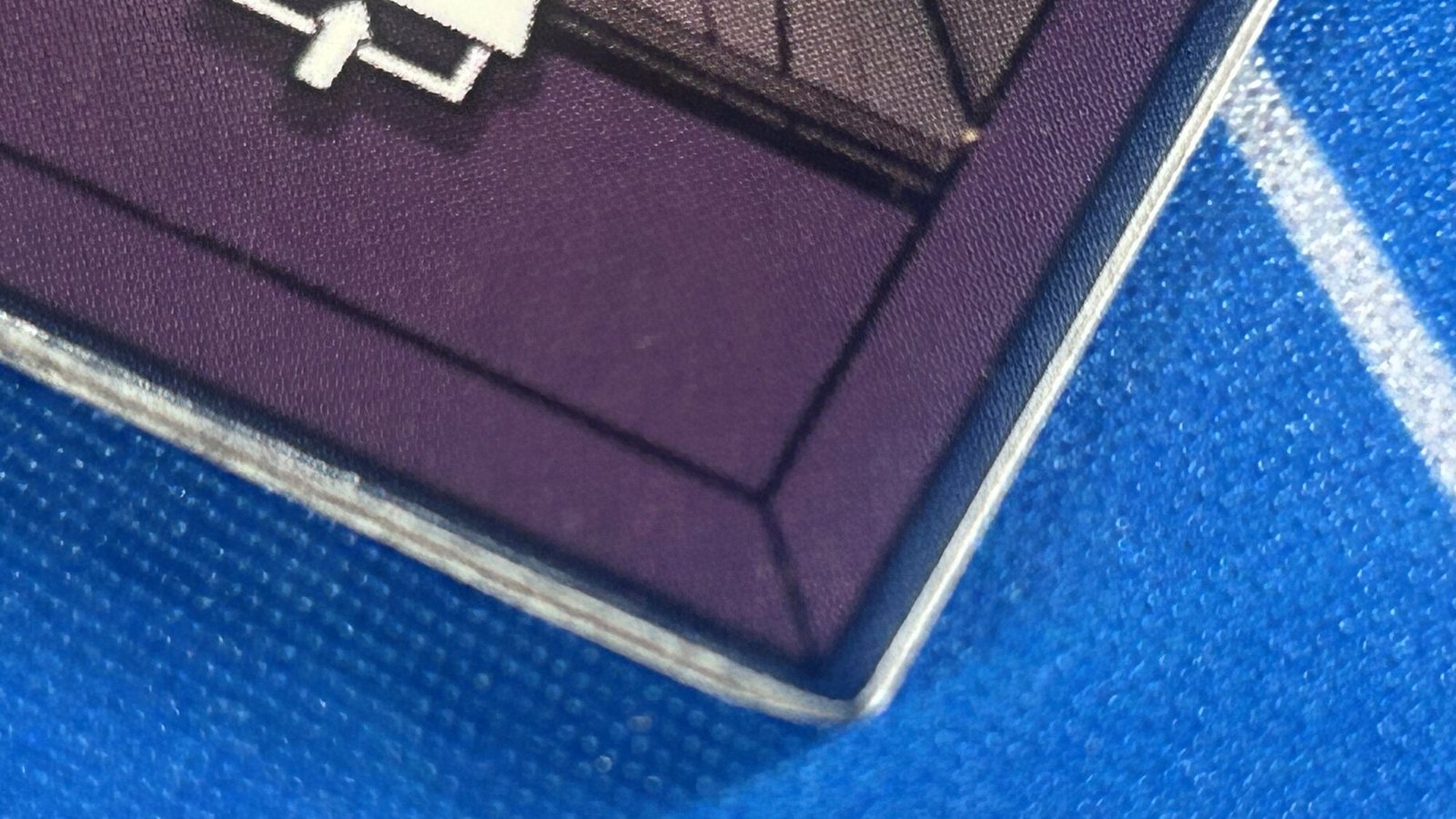
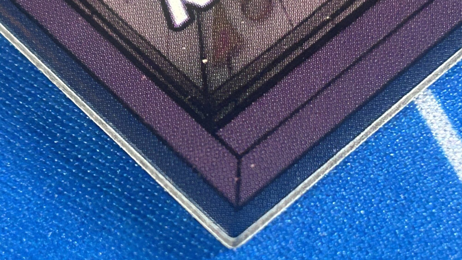
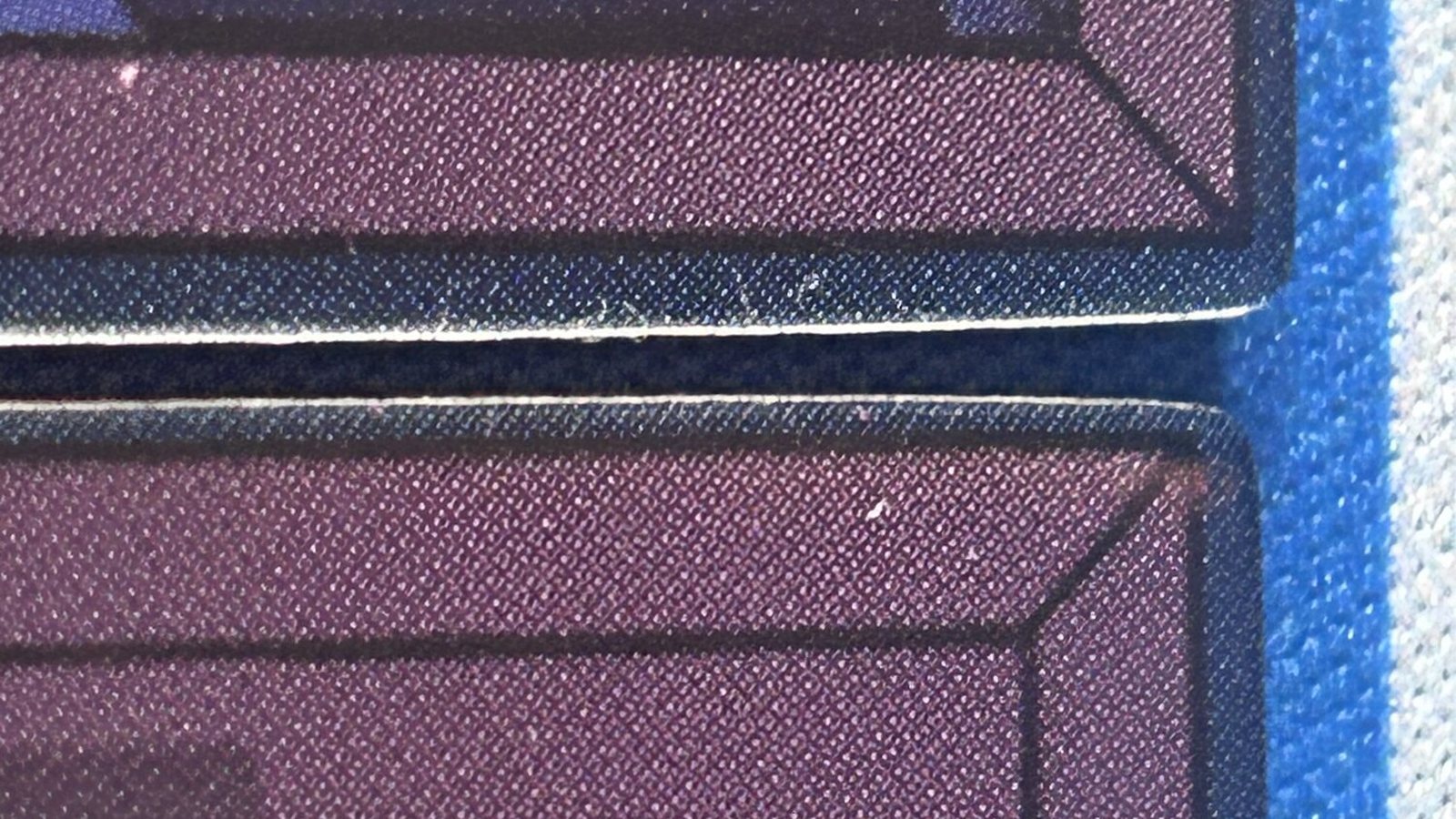
The die-cut is right. The blue rim isn't. Next print: bleed matches the frame.
The Keys
Props that don't need a legend
Two key props landed this month, and both read as objects rather than components. The Secret Garden Key is the official iam8bit replica, a small green flower-and-vine casting — you don't need the rulebook to guess what room it opens. The Archives keychain went a different direction: a plain metal key ring with a numbered tag, "370," the kind of prop that looks like it was actually pulled from a filing cabinet. It has no job in the base game yet. I made it with an expansion in mind, and it's sitting on the mat because it was too good a prop not to.
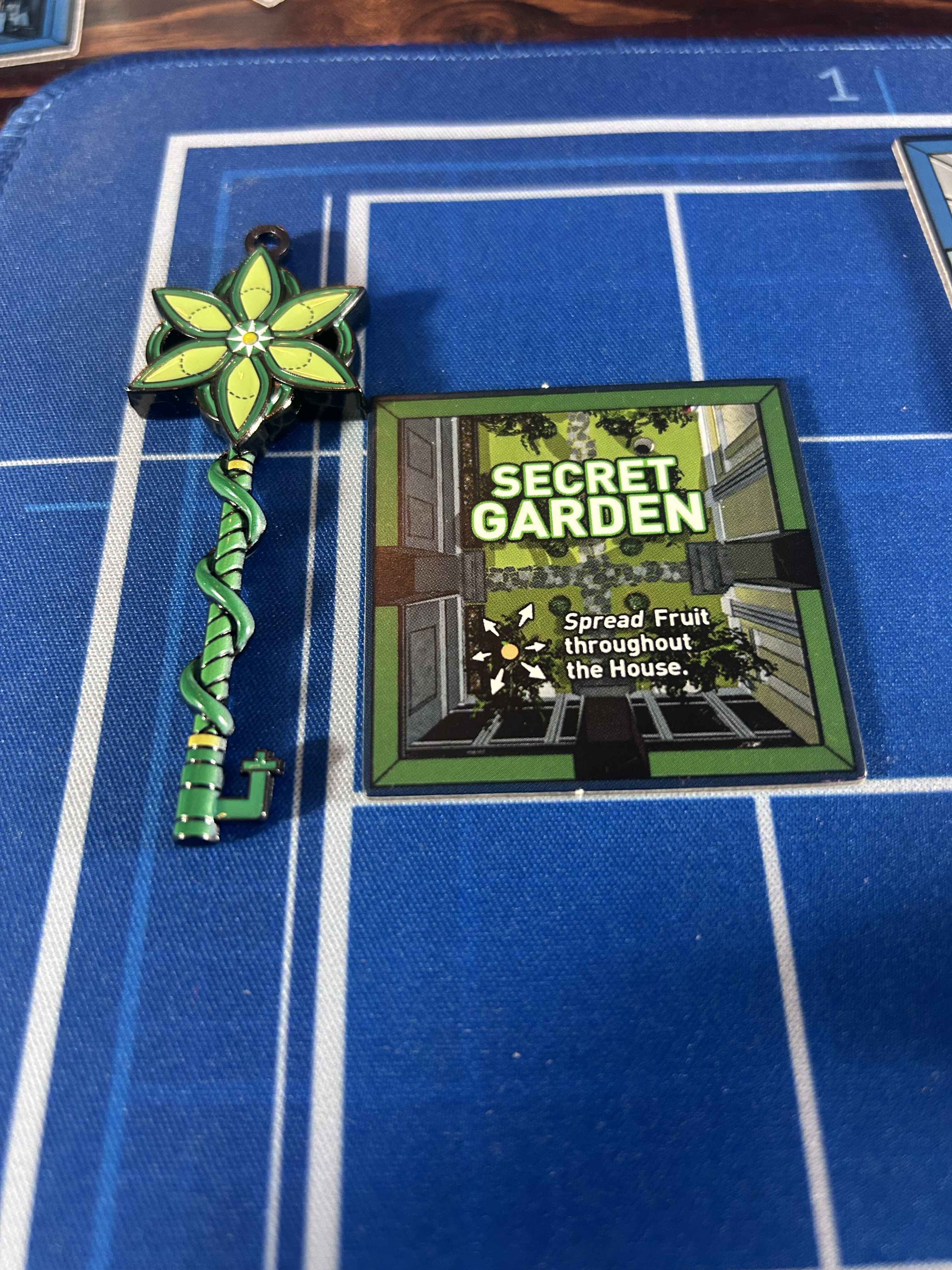
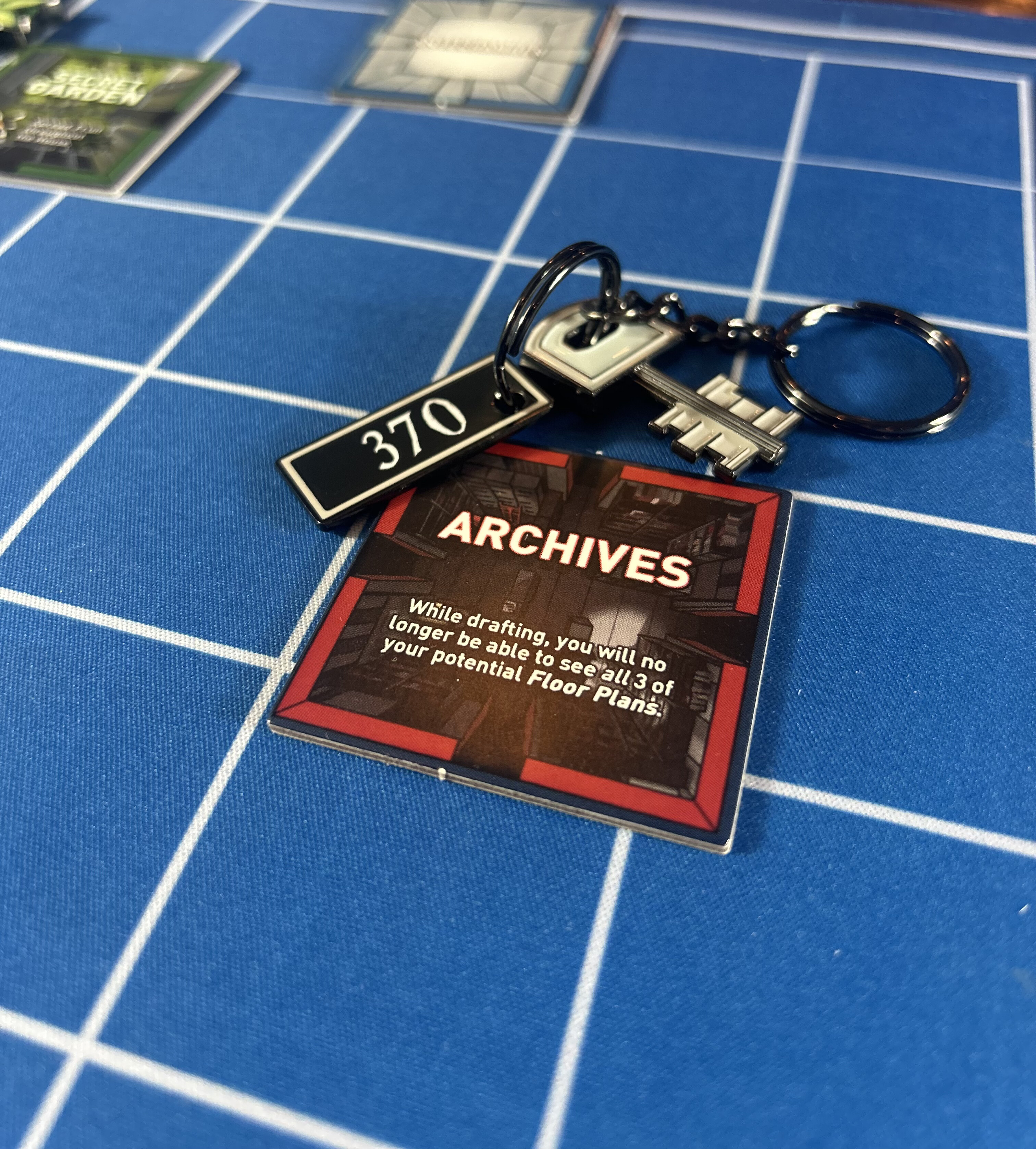
The produced tiles, on the mat.
But these tiles, printed professionally, look and feel amazing. That part isn't up for a vote.