Run 3 is mid-session as this is being written. The board is set up, the bag is full, and the game is playable — genuinely playable, not just technically operational. But standing back and looking at the full table for the first time, there's a new problem that no amount of rules writing anticipated: the sheer physical footprint of this thing.
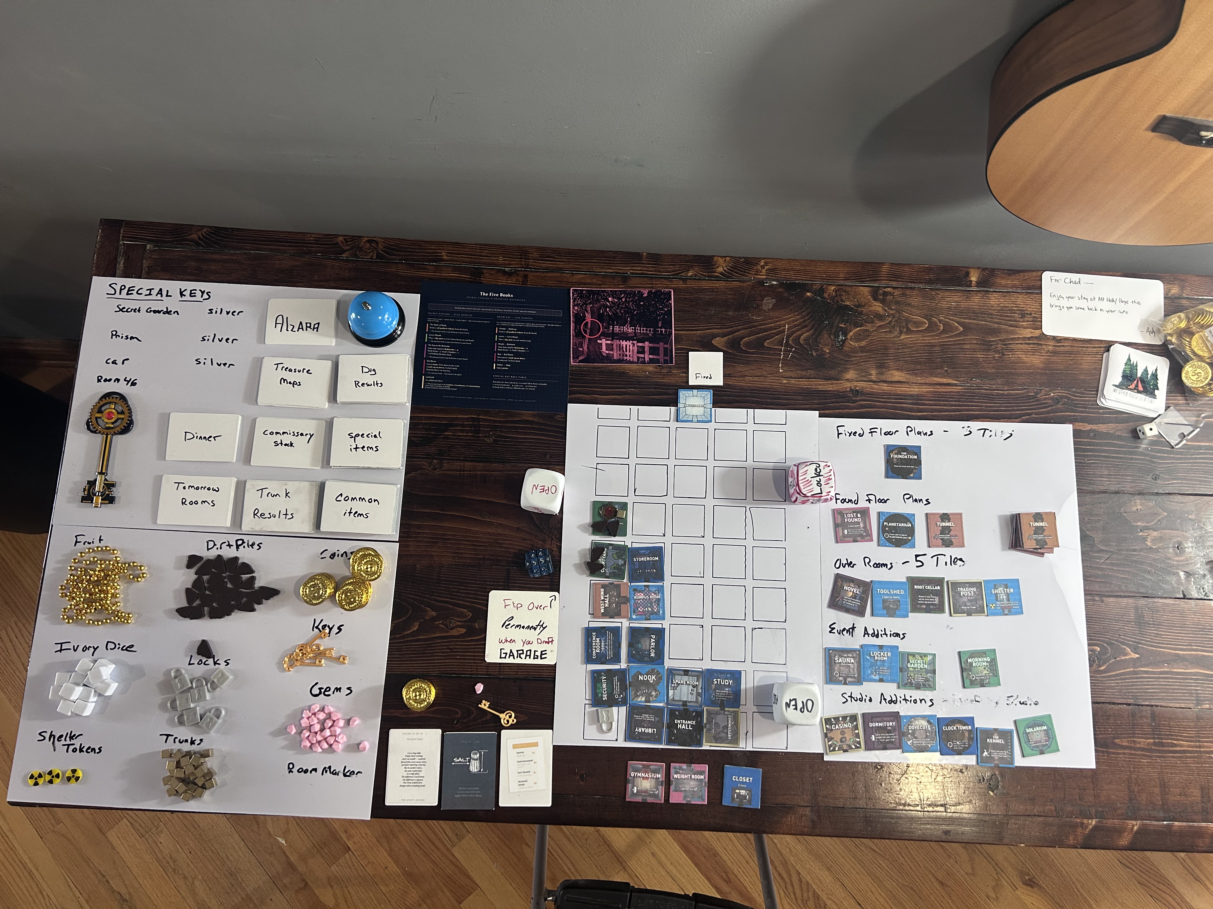
Two large foam boards. The main 5×9 grid on one. A full side board on the other organizing tile categories — Fixed Floor Plans, Found Floor Plans, Outer Rooms, Event Additions, Studio Additions. Plus a separate component tray for tokens, coins, gems, dice, and nine card decks. This is the small tile prototype.
What the side board actually is
The side board exists because during early prototyping there was no other way to keep tile categories visually distinct and accessible. Fixed Floor Plans can't go in the bag. Studio Additions are locked behind the Drafting Studio. Event Additions only enter the bag when triggers fire. Without some kind of visual organization, you'd spend five minutes at setup sorting tiles by memory.
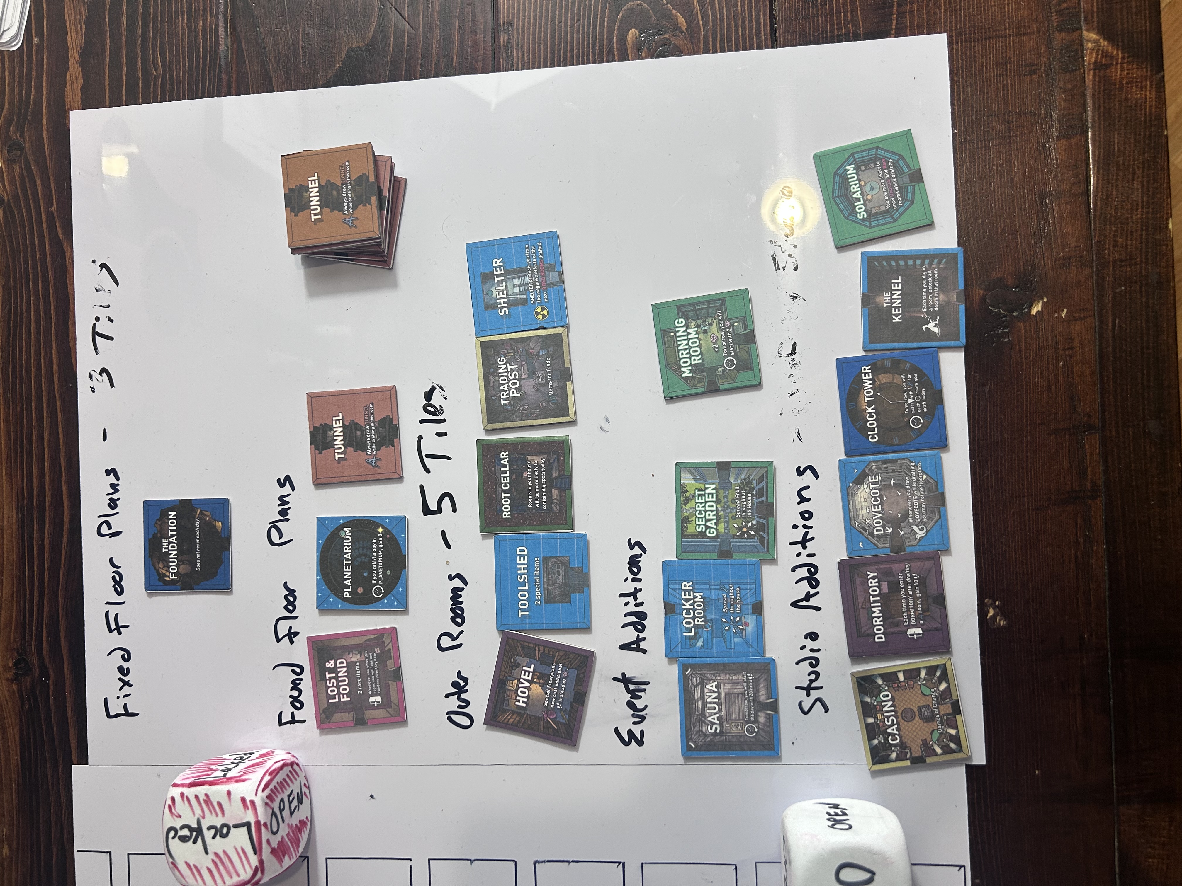
The labels are handwritten. The layout is logical. It works well as a development tool. But it's roughly the same physical size as the play area itself, which means the game requires twice the table it should. A production version solves this with labeled bags or box dividers — players reach into a labeled bag marked "Event Additions" rather than a dedicated board section. The side board is a prototype crutch. That's fine. It's doing its job.
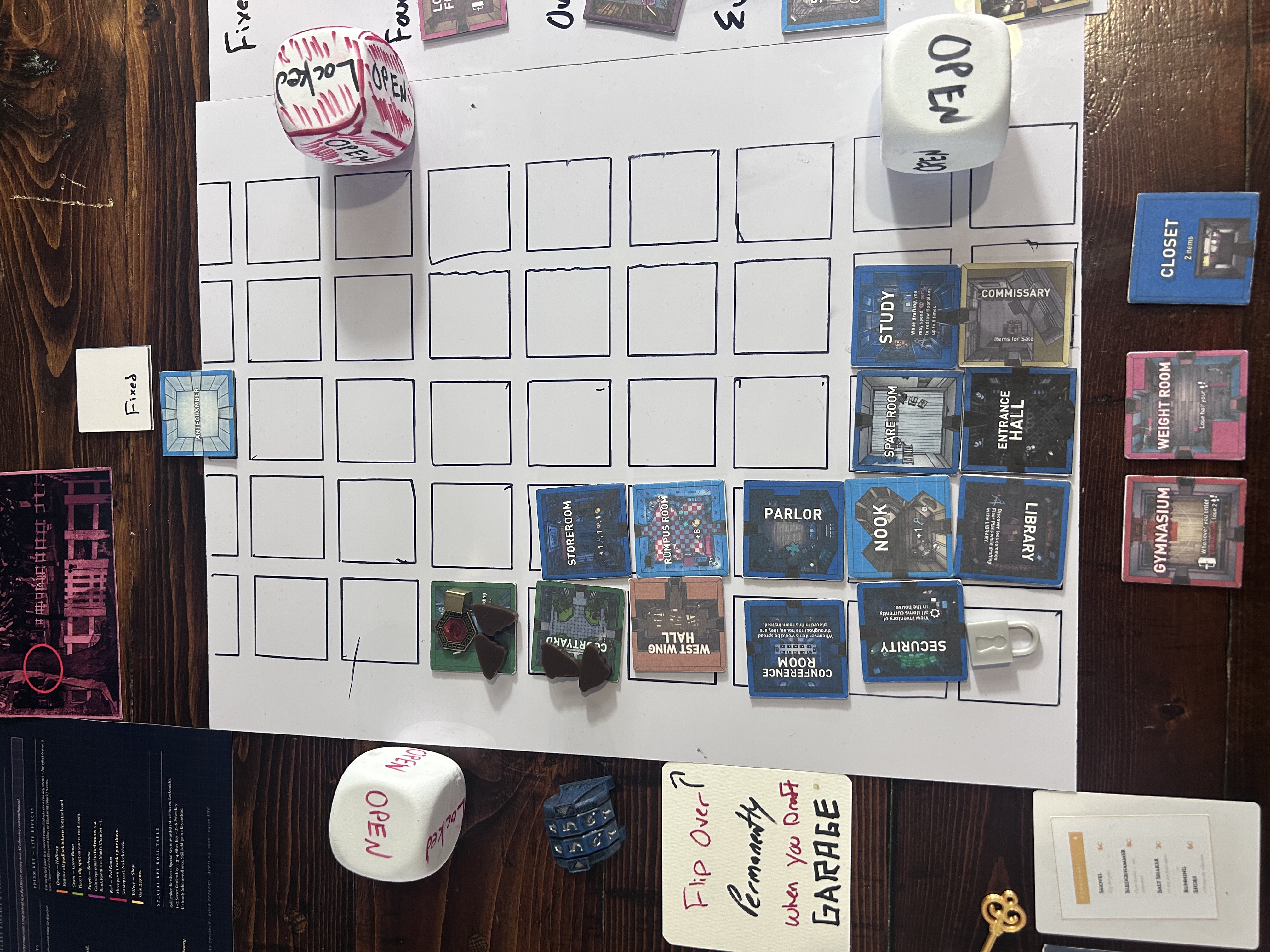
The more interesting question is the main grid. A 5×9 board at small tile size is still a lot of physical space, and most runs only fill 15–25% of it. You're looking at 35+ empty cells for the majority of any given run. In the video game that emptiness is invisible — the grid is there but the unfilled cells are just floor. On a physical board, 35 white squares stare back at you. It's not a bad thing aesthetically — there's a real sense of the manor being mostly undiscovered — but it raises the question of whether the board needs to show the full 45-cell grid at all, or whether tiles extending outward from a smaller starting point could work instead.
That's a question for after more playtesting. For now the grid stays.
Starting coins — confirmed at 5
Mid-run there was a moment of genuine confusion about the starting coin count. The player drafted the Commissary early and reached in for coins, half-convinced the starting total was zero. It's not. Setup Step 6 in the rules is explicit: 5 coins arrive with Simon each morning, described as his daily allowance waiting at the Entrance Hall.
The confusion is worth noting because it suggests the rules aren't surfacing that number prominently enough. It's buried in a dense setup step rather than called out in its own line. A future pass on the setup section should probably break starting resources out visually — a small resource summary box that lists Steps, Gems, Keys, and Coins at a glance.
Starting resources: 50 Steps · 0 Gems · 0 Keys · 5 Coins. The Commissary draft wasn't a dead end. Keep playtesting with 5 before considering an increase.
The Secret Passage confusion
The Secret Passage came up mid-run and created a pause. Not because the rules are wrong — the rules are thorough and correct — but because the player went directly to the Book Effects Reference card to resolve it and couldn't read the card. The text was there. It was just nearly invisible.
The Book Effects card uses a dark navy background — correct for the aesthetic, consistent with the reference card family. But the route text (the "→ The passage leads to..." lines) was set at 40% white opacity, and the body text at 75%. On screen that reads as atmospheric. Printed and placed across a table under ambient light, it reads as nothing. The orange Hallway entry appeared to say only "all padlock tokens" — the effect verb, the route description, and the instruction structure were all lost in the background.
This is a practical printing lesson. Low opacity works on a backlit screen. It does not survive cardstock and overhead light. All reference cards need to be proofed printed before finalizing — not just checked in a browser window.
Book Effects reference card contrast increased across all text layers. Route text now a distinct bright blue (#7ec8e3) rather than dim grey. Body text up to 92% opacity. Running Shoes note, section labels, and Special Key table all increased. Reprint before next session.
Treasure map orientation
A quieter fix, but an important one. The treasure map cards were rendering X positions using rank 1 at the top of the grid — the opposite of how the manor actually works. Rank 1 is the entrance (bottom). Rank 9 is the deepest point (top). The X marks were appearing near the entrance when they should appear in the upper half of the grid, well into the manor.
The VG wiki confirms all treasure locations are Rank 5 or higher. Our eight map coordinates were already correct on paper — col/rank assignments were all at ranks 5 through 8. The SVG was just drawing them upside down. Fixed. The cards now read correctly: entrance notch at the bottom, dashed path traveling upward, X sitting deep in the manor where treasure belongs.
What's on the table right now
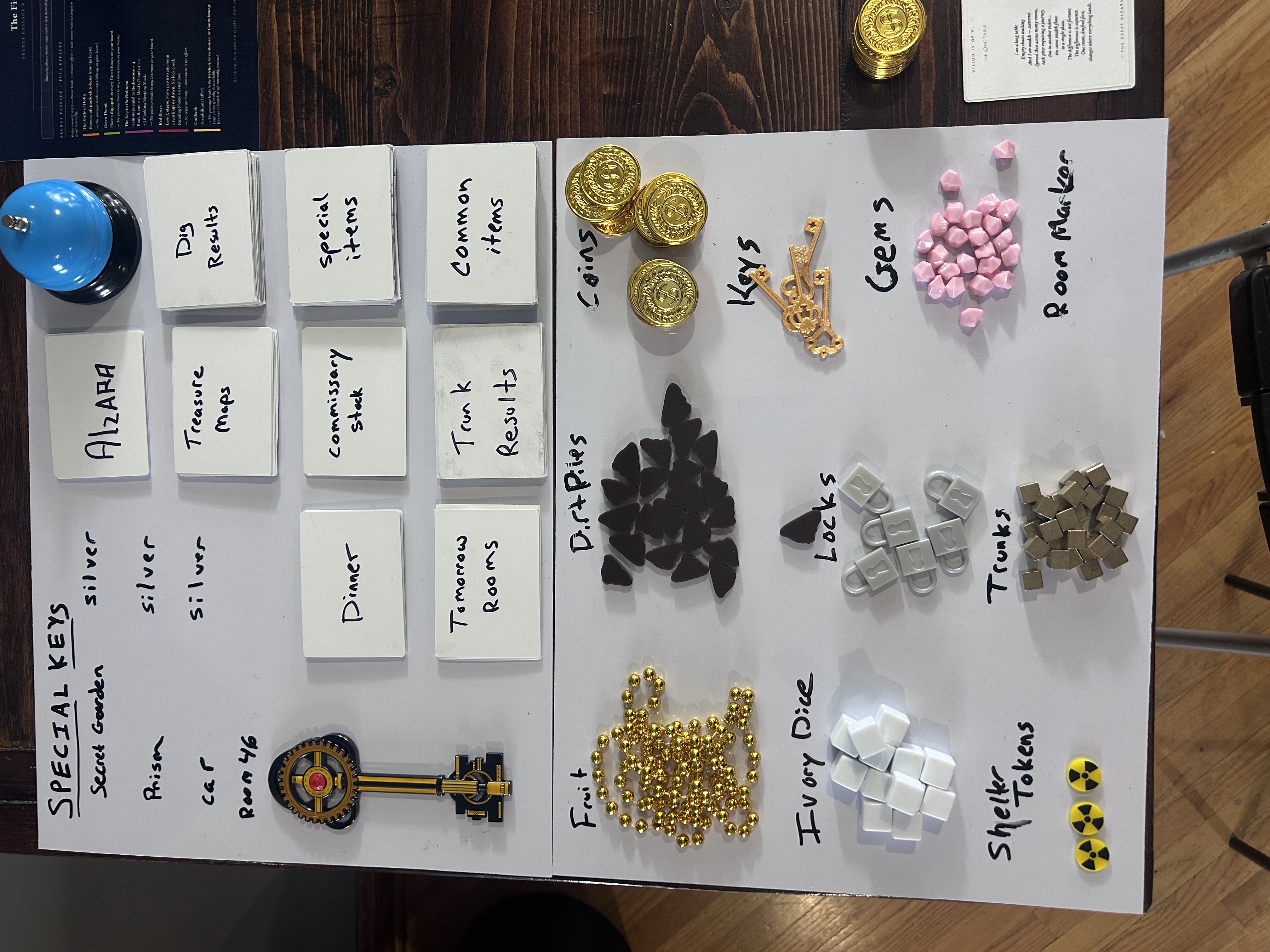
Looking at the full component spread — tokens, decks, keys, the bell — the physical game has come together more than expected. The pink gem tokens read clearly. The gold pirate coins are satisfying to handle. The service bell is the right object. The card decks are all labeled and functional even in their hand-written prototype state.
The tile art is the thing that makes it look like a real game. The room tiles have proper imagery — Parlor, Rumpus Room, Storeroom, Conference Room all visible on the board mid-run — and at table distance they're legible. The small size is a constraint but it's not a fatal one for this prototype stage.
Run 3 is still in progress. The board has more rooms than either previous run. That's the right direction.
Book Effects reference card (contrast fix — reprint immediately). Treasure map cards (rank orientation fix). How to Win page (new — added this session). Starting resource summary box in rules (pending rules edit).